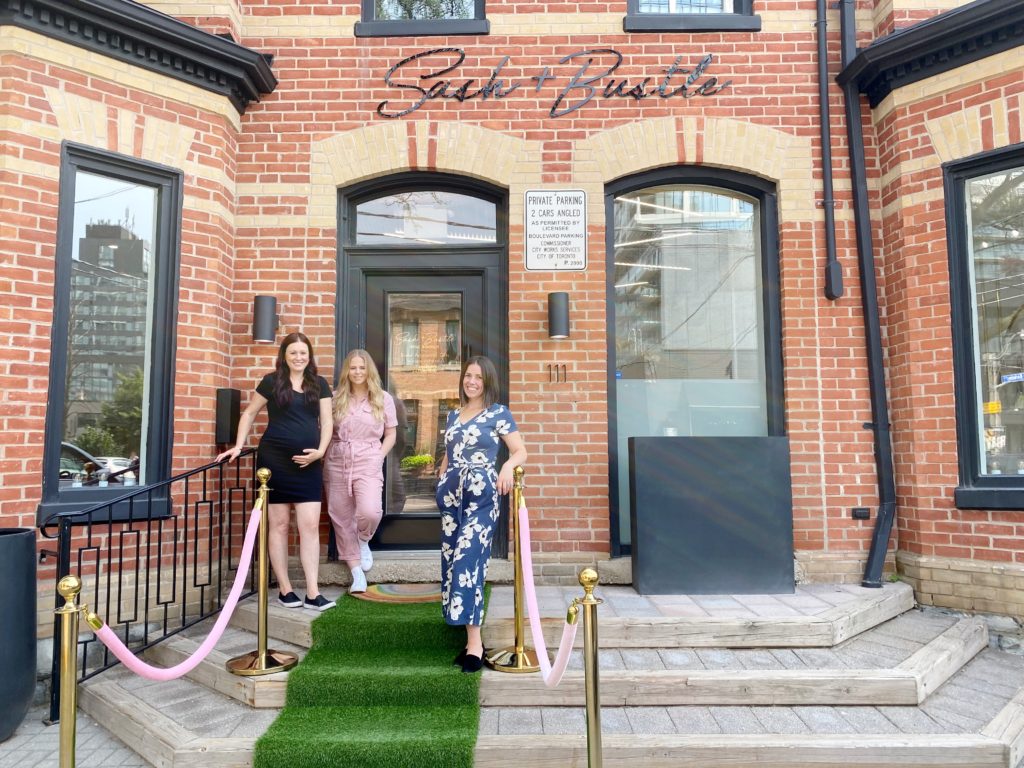
Beckee and Lexi of Paper & Poste with Andrea of Sash + Bustle
Talk about an evolution – Sash + Bustle has come so far in the last 7+ years; that includes the Sash + Bustle brand.
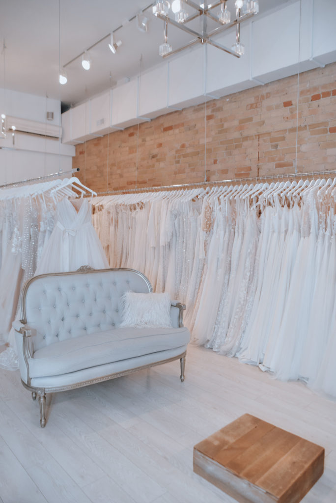
Sash + Bustle’s former location and logo 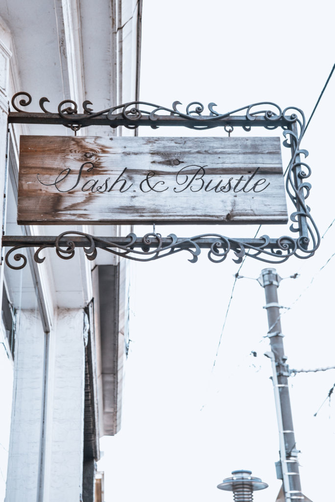
Sash + Bustle’s former location and logo
We had an idea, all those years ago; about what we wanted Sash + Bustle to be. We wanted it to be modern, fun, inclusive, relaxed and luxurious. But the evolution of the S+B ‘brand’ is something we wold hone over the years with experience and growth, while taking direction and inspiration from our Berkeley St location.
In 2019 we knew that we had not only outgrown our home on Queen St E but also were ready to take our business to the next level. We began searching for a space that would become our forever home. *cue 111 Berkeley St* — when we saw the space we knew we had found the one; and when we teamed up with the design team at Leventhal-Vermaat, that’s when the magic really started. We began collaborating on a design directive for our new space that would become the basis for our rebrand. We wanted the brand to evoke the destination; with all the feeling of a fun yet upscale experience.
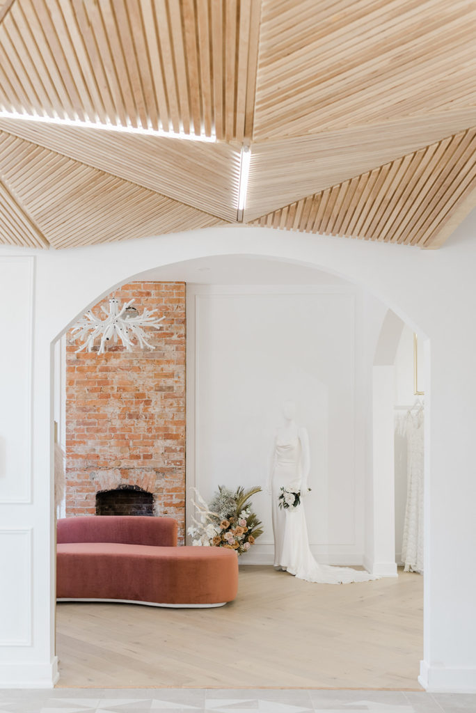
Interior shot of Sash + Bustle at 111 Berkeley St by Alix Gould 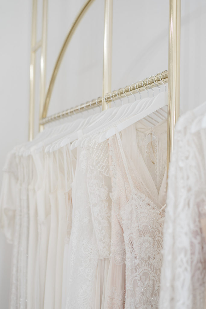
Interior shot of Sash + Bustle at 111 Berkeley St by Alix Gould
We began working with Paper & Poste; a women-led graphic design team specializing in custom wedding stationery and branding. We poured over the design directive to draw inspiration for what would be our new colours, fonts, logo and slogan – the important creative essentials we would need going forward.
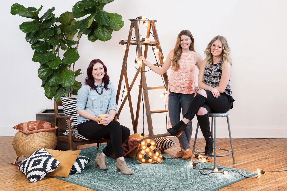
Paper & Poste – graphic design team specializing in custom wedding stationery and branding
They made it so easy and helped bring our vision to life – they created a dozen different brand kits and we all collaborated on the best ones that led to all this final bit of MAGIC!
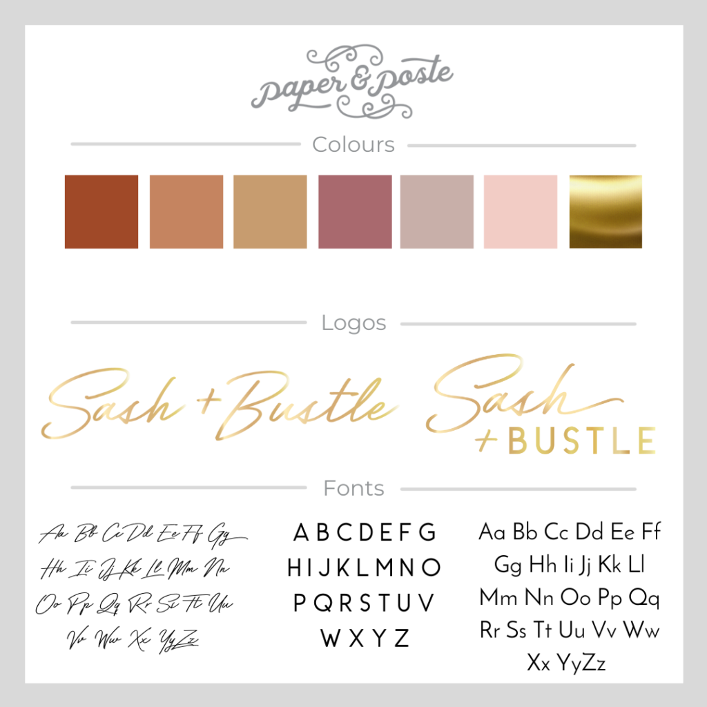
Final Design Directive
Now we pass the mic to these brilliant creatives to answer some questions on the process of rebranding S+B
How did S+B’s new space and interior inspire you?
“When a business is so directly linked to a single brick & mortar space, it’s imperative that the branding accurately represents the details and feeling of the environment. Luckily, the Dineen sisters were working with amazing interior designer, Leventhal-Vermaat Design Studio, to develop their new shop at the same time, so we had some amazing visuals and inspiration to go off of. The shop has such a distinct look and feel to it – a mix of raw materials and shiny, feminine details, a lot of pattern play, and somehow successfully feels both fancy and chill at the same time. The building itself has a historical feel to it, yet much of the interior is modern and new. There’s a lot of juxtaposition of contrasting design elements going on, which helped direct S+B’s new branding.”
What inspired this colour palette?
“It sounds like an oxymoron, but the colour palette is truly a set of contrasting neutrals. The concept of the bridal shop is feminine in nature, but S+B specifically has a bit of an edge that attracts off-the-beaten-path brides. While whites and pinks are a mainstay in the wedding industry, it’s the addition of rust, mauve and gold that set the branding apart from other wedding vendors and make the branding feel truly unique and fresh. Somehow this eclectic palette still feels neutral enough to not interrupt the sea of white dresses in-store. The way the palette was translated into the interior design is immaculate. The rust velvet chairs bring in a luxe, retro vibe, and the bold mix of patterns help keep the palette consistent throughout.”
How did you see the brand evolving?
“Like so many small businesses, S+B’s original logo and palette were created when the brand itself was still growing. Since then, the business has set itself apart from other bridal boutiques, and established a personality all its own. This called for a rebrand that represented their very specific aesthetic, vibe and values. It was perfect timing with S+B’s move to their Berkeley Street location, where questions about colour palette and visual brand representation were prompted by a big reno and decor overhaul. By that time, Vanessa and Andrea had a clear idea of what they wanted Sash + Bustle to look and feel like, they knew what aesthetic would resonate with their clients, and we were excited to play a part in that transformation.”
How did you come up with ‘the best is yet to come’ slogan?
“Sash + Bustle has evolved and grown SO MUCH since their early days at their first little boutique. They’re a phenomenal example of a small business successfully expanding while staying true to their own values and creative direction. It feels like a very ‘apropos’ phrase to both describe a bride’s anticipation of getting married, while also referring to S+B’s story of growth and anticipation of all the amazing things that are yet to happen in their business. A rebrand can feel like a big leap, especially when paired with a move to a much bigger storefront. It’s a reminder of how far they’ve come, and how they still have so many successes to look forward to.”
How does S+B’s fonts evoke a feeling?
“Referring back to S+B’s ability to feel both fancy and chill simultaneously, the typography had to reflect that as well. Sash + Bustle has a reputation for being cool, comfortable, incredibly inclusive; the opposite of stuffy. We went with a timeless script typeface that feels effortless and relaxed, as if it came from a handwritten note, and grounded it with a modern, clean sans serif. A subtle combo that describes S+B’s vibe perfectly”
How would you describe the S+B brand?
“Sash + Bustle can be personified as the cool girls who don’t know they’re cool (which is ironically, the coolest thing you can be.) Inclusive, comfortable, relaxed. Wildly stylish, but not boastful about it. Badass, but warm. Innovative, creative, sure of themselves and their creative direction. Appreciative and respectful of the traditional nature of wedding gowns, but always happy to break the rules.”
All. The. Feels.
Thank you to Paper & Poste for all your hard-work and for being such an important part of the growth of Sash + Bustle.

Add A Comment
VIEW THE COMMENTS